If you've used Lovable, your website looks like a hundred others.
Sometimes that's fine.
Most of the time it's a quiet failure your founder hasn't noticed yet.
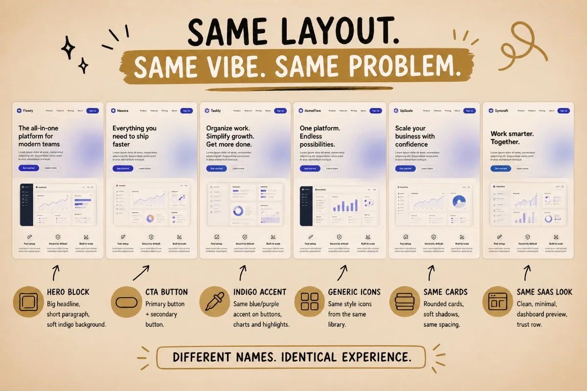
Look at any twenty AI-built sites side by side.
Same hero layout.
Same button hover.
Same indigo accent.
Same icon set from the same library.
Same vibe.
The model has seen Indigo-500 a million times, so it ships Indigo-500. And the tools optimise for it.
Lovable lets you build in fifteen minutes. Speed is the pitch. Visual identity is the trade. I've been designing in Figma for years. I run Lovable, Claude Design, Codex and a lot of other tools when I need to move faster or drop down a layer.
Those tools are extraordinary.
They are also opinionated.
If you let them, they hand you back the same website your competitor got last week.
Why this matters
Right now, "AI-built" looks like a stage.
People notice.
They squint.
They feel the sameness.
That feeling carries over to your brand whether you wanted it to or not.
The companies winning here understand a basic shift:
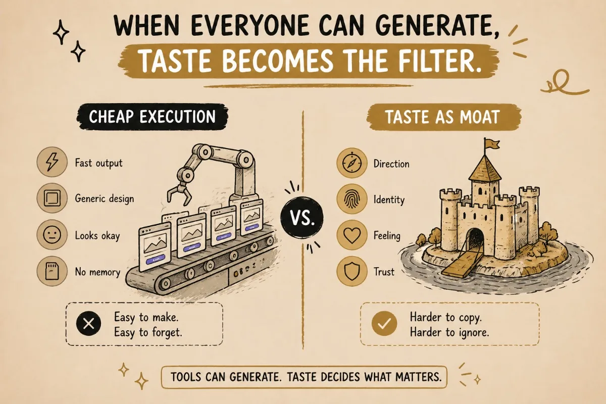
When execution gets cheap, taste becomes the moat.
The cost shift
There is another part people are still underestimating.
AI will cut production costs over time.
Not only in design. In every sector.
- Admin.
- Sales.
- Content.
- Development.
- Research.
- Customer support.
- Strategy.
- Operations.
The same thing is now happening in creative work.
Logo design becomes faster because the inspiration pool is bigger.
UX/UI design becomes faster because we can explore more directions before committing.
Strategy becomes sharper because AI helps expand the thinking, pressure-test ideas and expose gaps earlier.
That does not mean creative work becomes cheap.
It means the old pricing logic starts to break.
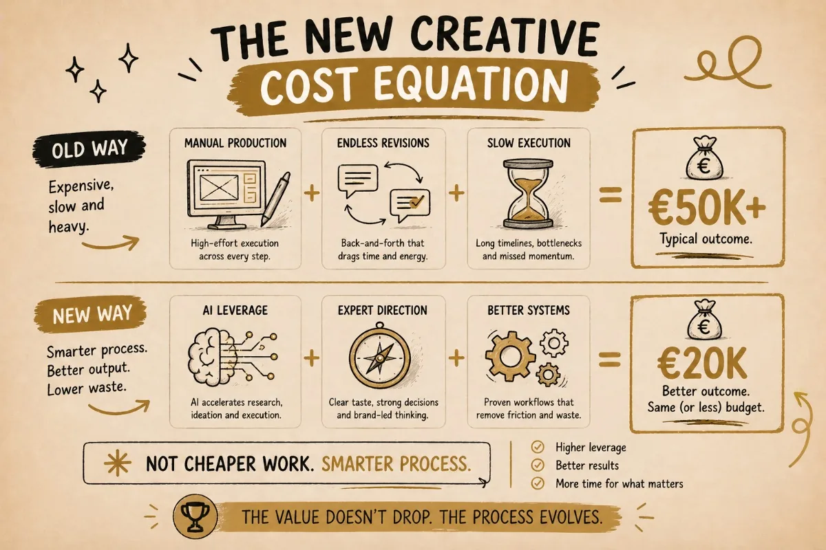
In the past, a serious brand, website or product build could easily become a €50k+ project because of the amount of manual execution involved.
- Research.
- Concepts.
- Design directions.
- Production.
- Revisions.
- Copy.
- Flows.
- Layouts.
- Handover.
Now, the same type of outcome can often be created for €20k sometimes with better results.
Not because the work is worth less.
Because the process has changed.
You may pay a higher hourly rate than before, but the output per hour has 10x'd.
The expertise is denser.
The thinking moves faster.
The waste is lower.
And honestly, that matters for both sides.
For the client, it means better work becomes more accessible.
For the creative, it means less endless production stress and more time spent on the parts that actually matter:
Taste.
Direction.
Strategy.
Decisions.
I think 2026 will be the year where more businesses choose quality that is suddenly affordable.
Not cheap quality.
Real quality, made faster.
That is a huge shift. And it is exactly why creative people who understand AI have a window right now.
A real example
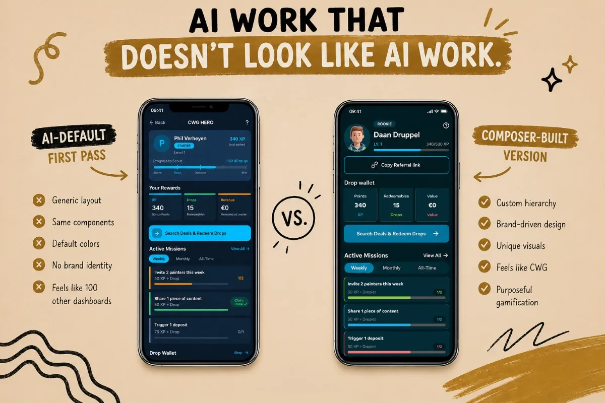
Last month, I was building a gamification module inside a CWG application.
I asked the AI to design the first version.
It shipped exactly what you'd expect.
The standard AI dashboard.
- Nice enough.
- Functional.
- Generic.
- Same buttons.
- Same panel rhythm.
- Same accent on every component.
Same feeling you see in hundreds of other AI-built interfaces.
Then I rebuilt it.
- Same feature.
- Same time budget.
- Completely different result.
- Custom illustration logic.
- Clearer visual hierarchy.
- Components that matched CWG's identity.
Active missions that felt like part of a real reward system instead of a default dashboard list.
The first version worked.
The second version felt like CWG.
That difference matters.
The AI didn't get worse.
I just made the AI work for the brand, instead of the brand working for the AI.
How I do it
Most AI builders are developers without design taste.
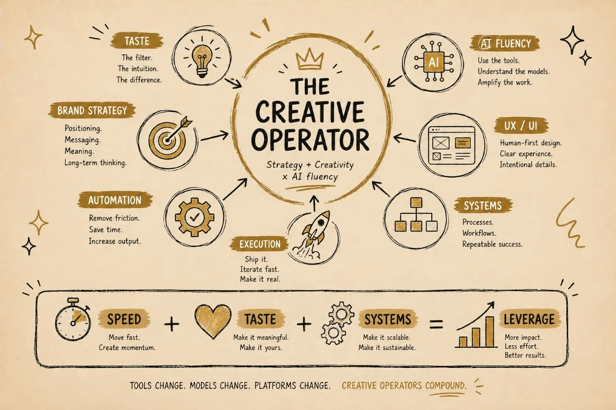
Most designers can't direct AI. I sit at the intersection.
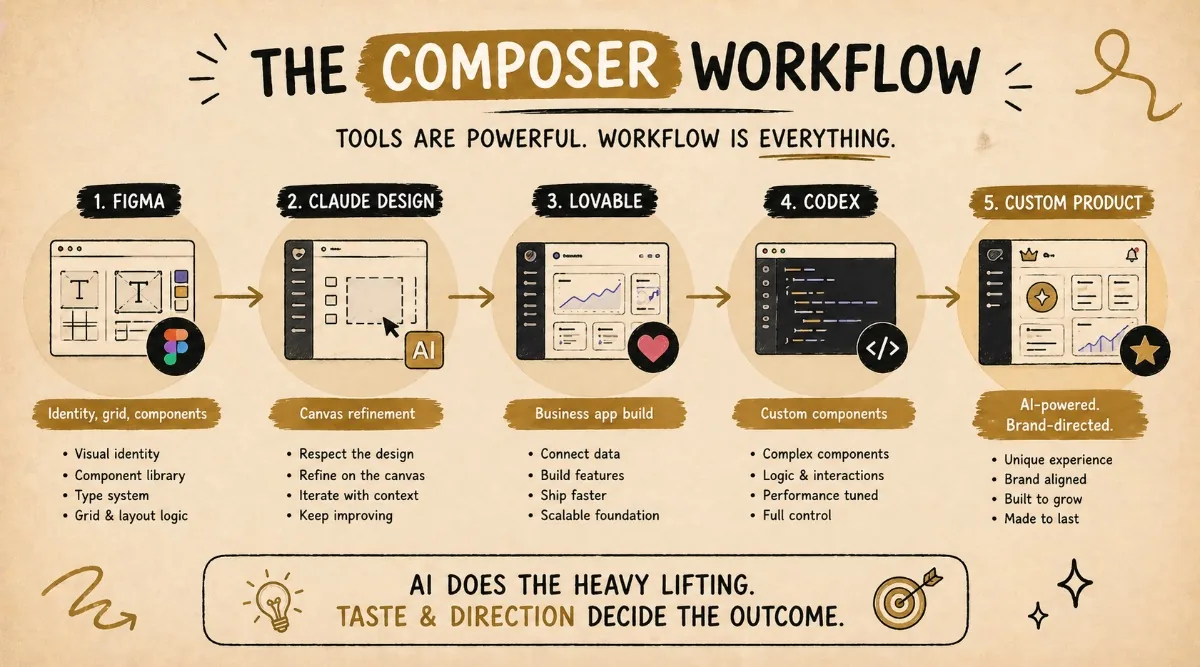
That's the entire wedge. The actual workflow looks something like this:
- Design the visual identity in Figma like a normal job. Real components, real type system, real grid logic.
- Upload the Figma file into Claude Design. It's still in beta, but it respects the file and lets me keep customising on the canvas.
- For business apps, the same logic flows into Lovable. Yes, you can crack Lovable to look genuinely custom. It just costs more credits and more time than the marketing suggests.
- For deeper components-from-scratch work, I drop into Codex.
The tools are not the differentiator.
The taste and the AI fluency, sitting in the same head, is the differentiator.
That is where the leverage sits.
Not in knowing which button to click.
In knowing what the output should become.
What's coming
Speed is now the floor, not the ceiling.
Every business will ship fast.
Every business will have access to tools that can create websites, apps, campaigns, content and workflows faster than before.
That is not where competition lives anymore.
Competition lives in feeling.
In what your customer experiences in the first three seconds.
In whether your product feels like yours or like a screenshot of last week's hackathon.
The new advantage is not just being faster.
It is being faster without becoming generic.
Creativity gets pulled to the front of everything.
Not just the system.
Not just the messaging.
The visual experience the customer walks into.
The studios that survive 2026 will not be the ones simply using AI.
Everyone will be using AI.
The ones that survive are the ones whose AI work does not look like AI work.
Want a quick teardown?
DM me a screenshot of an AI-built site, app or landing page that feels too generic.
I'll send back a 3-point teardown:
- What makes it look like AI work.
- What weakens the brand.
- What I would change first.
Free. Three-day turnaround.